These days when a new camera or lens is released all everyone seems to be talking about is “sharpness” and “resolution”.
To me those aren’t critical in neither a lens nor a camera body but I do prefer my images sharp and contrasty when I shoot wide open.
In this test I would like to investigate the sharpness and color fringing of my contenders.
What is color fringing?
Color fringing is a result of chromatic aberrations which in turn are a result of the physical properties of light.
Light consists of different wave lengths that are being separated after passing glass with nonparallel surfaces, like in a concave/convex lens. (the prism being an extreme example of that effect)
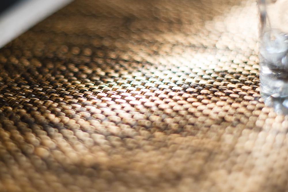
In this image of a wickerwork place mat you can clearly see the purple fringes in front of and the green ones behind the focus area. This effect usually occurs in areas with high contrast as in bright reflective surfaces versus dark spaces in between. (Shot with the Fujinon at f/1.4)
Camera manufacturers try to avoid chromatic aberrations by adding glass elements to counteract this effect (so-called apochromatic lenses) but many old lenses (and many new ones too) do not have these and therefore chromatic aberrations are something we have to live with.
Chromatic aberrations are strongest when a lens is used wide open and result in a subjective loss of sharpness and contrast in the final image (as with the image above).
However, you can often deal with those aberrations in post processing and therefore it’s not such a big deal anymore.
I did it for the picture above and this is what it looks like now:

How did I measure sharpness and color fringing?
I have to be honest with you guys. I took another page from Dustin Abbott‘s playbook (pun intended).
I wanted to display the color fringing as well as some primary aspects of sharpness and I knew that I wanted to use some sort of text for that matter.
I recently started watching Fox’s Sleepy Hollow where everything revolves around the book of revelations. I’ve always been a big fan of terrifying bible citations in dark and sinister movie plots (e.g. the misinterpreted but world-famous bible vers cited by Samuel L. Jackson in Pulp Fiction).
I ended up using the sixth chapter of revelations from the King James Bible, printed it in Lucida Calligraphy (size 9) and laid it on an even surface on my couch table.
I lit the paper with my Selens umbrella octabox (32″ or 80cm) and a Yongnuo YN560 IV flash inside.
I’m afraid, I terribly messed up with the white balance. I didn’t use the grey card because I thought the white paper would be enough…
It wasn’t!
I set the camera profile to neutral and applied the usual amount of sharpening in Lightroom (RAW files need sharpening, jpgs out of camera always receive it!). Then I tried to get the white balance right and realized that it’s incredibly difficult with all the different color casts of my lenses.
I have a test chart from Bob Atkins that I will use to give the lenses another go contrast and sharpness-wise.
Wide Open
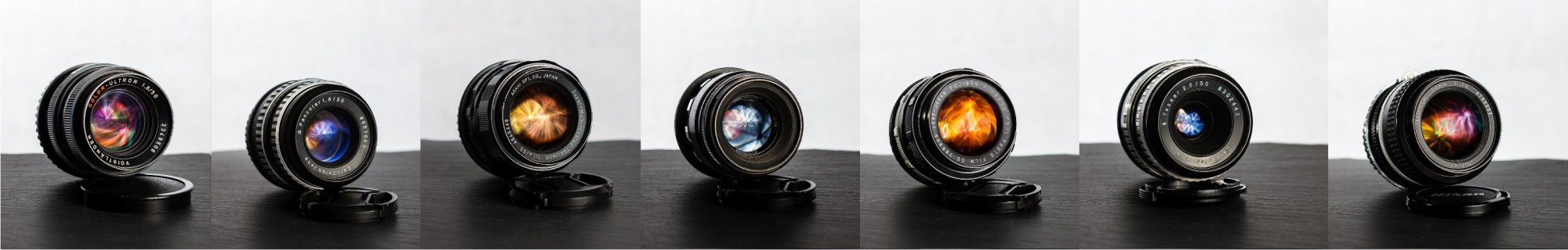
My three 50mm f/1.4 lenses were put to the test first, shot wide open.
 Sharpness:
The Takumar is the clear winner here. However, it’s curious to see that only the words over the fourth are actually sharp and everything around them is blurred. I tend to blame field curvature for that effect but then the focal plane should be visible spanning other words in lines above or below the one I focused on. Any ideas?
The Nikkor is rather sharp as well but I somehow missed the focus on that one slightly. (I was aiming for the word over with all lenses.)
The Fujinon is, as I’ve realized before (especially in real world samples), extremely soft wide open. I would love to know if that’s just because I might have gotten a bad copy or if this is known for the non-EBC coated version?
Aberrations:
The Nikkor fares worst in this regard. The purple and green fringing start very early and are pronounced quite strong. This results in the picture looking less contrasty.
The Fujinon has a little more fringing than the Takumar and, combined with the lower sharpness, therefore looks worse overall.
Comparison at f/1.8 and f/2 respectively
This comparison shows some lenses wide open (the upper row) vs the speedsters with their aperture closed by 1 stop. We expect to see the reverse from the Bokeh test, where shots wide open resulted in perfectly round bokeh balls and closing the aperture revealed the shape of the latter.
When you close the aperture of a lens you generally gain more sharpness and reduce chromatic aberrations, therefore you also gain contrast.

Sharpness:
The Pancolar clearly stands out in the crowd.
Also, the Takumar now is really sharp with uneven shapes on letters showing already.
The Nikkor performs really well too, whereas the Fujinon still seems really soft.
The Color-Ultron surprised me somewhat, given the sharpness I observed with real subjects so far. Maybe the Atkins chart will reinstate my believe.
The Helios never was intended as a sharp lens and therefore I was quite surprised at how well it performed.
The Yongnuo is a sad disappointment but I knew that already. I had another copy that performed much better wide open, but I gave that away to a student of mine. With these lenses you really need to check several samples to get a good one.
Aberrations:
The Yongnuo is terrible in this regard as well. The fringing starts already on the very line I focused on.
The Nikkor still suffers from rather strong color fringing but the good sharpness makes up for that somehow.
The fringing in the Fujinon and the Takumar is rather clearly defined and should be easy to remove.
The Pancolar wide open looks better aberration-wise than the Takumar and the Fujinon and also the Color-Ultron fares quite well in this regard. It’s not as sharp as the Pancolar, therefore the contrast seems weaker, I suppose.
I was, however, totally surprised when I checked the Helios. Yes, the picture isn’t really sharp, but there is almost no color fringing anywhere to be found! The Helios clearly isn’t a lens for everyone, but with all its quirks and perks it presents an amazing “specialty” lens and I really start to love it for that.
I will talk about that in more detail when I get back from the UK where I will bring the Color-Ultron and the Helios (I don’t dare to bring the thoriated lenses on a plane) for various real world applications.
At f/2.8
f/2.8 is what normal photographers (and many pros) consider a fast aperture. To me it’s the smallest aperture I will go to when I need more depth of field in available light situations.
 First of all, it now is absolutely and indisputably clear that the Pancolar earns the crown for the sharpest lens in my collection of fifties. By now it’s also almost free of any aberrations and delivers great contrast.
The Takumar and the Nikkor are incredibly sharp at f/2.8 but they both present some clearly noticeable chromatic aberrations along with the very high detail they resolve.
The Fujinon and the Color-Ultron are somewhat comparable at this stage with good sharpness and almost no fringing left.
The Helios still shows no sign of chromatic aberrations but also still seems rather lacking of sharpness. The lack of fringing does help with the contrast and the overall impression is pretty good, I’d say.
The Tessar enters the ring with almost no color fringing but also a complete lack of sharpness and micro contrast. The text looks as if it was printed in the “quick” program.
The Yongnuo performs quite well sharpness-wise but it still suffers from massive chromatic aberrations that leave it looking rather pale.
At f/4
I rarely use any of my lenses at f/4. When I shoot stuff that requires small apertures, I usually take f/5.6 to f/11 (for studio and landscape work).
 Aberrations:
There’s almost nothing left of the color fringing by now.
The Yongnuo still shows a little which reduces contrast somewhat.
Sharpness:
All the lenses, except for the Tessar, are now very sharp and I’m curious to see what the Atkins chart will reveal.
At f/5.6
I like that aperture for my off-camera flash work in class. It gives nice depth of field while still allowing for the use of native iso sensitivity in combination with simple speedlights, color gels and light modifiers.
 The Tessar still lags far behind sharpness-wise and the Yongnuo suffers from a little bit of color fringing even at this tiny aperture.
Comparison at f/8 for the sake of it
f/8 is also very nice for flash work.. Have you ever tried to manually focus a lens that’s stopped down to f/8 in an artificially lit room? Maybe that works with flash heads with modelling lights but certainly not with speedlights*.
 As expected, you cannot really tell these lenses apart at that aperture.
*Sidenote: Using the Helios in such a situation could be pretty nice, because you can actually preset the aperture to f/8, then meter and focus and right before you pull the trigger, you close the aperture to the preset value with the same finger you used to focus.
Conclusions?
Sharpness and (the lack of) chromatic aberrations are important qualities for a lens. At small apertures every lens will be sharp and render contrasty images without any color fringing.
However, if you – like me – want to use a fast prime lens mostly at large apertures (f/2.8 and wider), it is very important that the lens performs accordingly in this area.
A lack of sharpness and/or strong chromatic aberrations result in a lack of contrast and the pictures looking flat.
To me the Zeiss Jena Pancolar 50mm f/1.8 is the clear winner in this comparison. It is incredibly sharp even wide open at f/1.8 and almost free of any color fringing.
The SMC Takumar 50mm f/1.4 also delivered on the promise of being a really sharp lens but it had me somewhat confused at f/1.4 with only one word of a line really being in focus.
The Fujinon 50mm f/1.4 leaves me very disappointed as a Fuji fan, I must admit. Enough said.
I am curious to see how the Color-Ultron will perform on the Atkins chart, because I really expected a lot more sharpness-wise. Just look at this 100% crop from a picture I took this week. It was taken at f/1.8, the wind was constantly moving the lavender around and the bumblebee was going crazy but I captured some nice images of it anyhow. 

Thanks for the comparisons! I’d love to add some of the CZ Jena lenses to my collection at some point. Regarding comparisons between 1.8 lenses and 1.4 lenses, I’m not entirely sure it’s a fair comparison from what I’ve read, I think there were some tradeoffs made back in the ’60s/’70s to be able to make the lens faster. I have the 55mm 1.8 SMC Takumar which is reputed to be sharper than the 1.4 Takumars, it would be interesting to compare the 1.8 SMC Takumar to the 1.8 Pancolar.
LikeLike
I guess you always have compromises because there is more glass involved and the body of the lens remains the same size. vignetting and loss of sharpness towards the outer edges is the most common deficit of such lenses.
I don’t believe that the 1.8 is sharper than the 1.4 but I really believe in sample variations and those were supposed to be quite large back in the days.
It could therefore be that my Pancolar is an exceptionally good sample or the Takumar is a bad sample or that people who own both a Tak 1.8 and 1.4 have a good sample of the former and a bad one of the latter.. who knows?
LikeLiked by 1 person
There are lots of vintage 50mm you should try.
I have owned
Pancolor 50mm 1.8 Zeiss
Rollei HFT 50mm 1.4 Zeiss
Tessar 50mm 2.8 Zeiss
Pentax smc 50 F2
Pentax super Tac 50 1.8
Pentax smc 1.4
Pentax smc 1.2
Leica Summicron 50mm Version 1
Minolta 58mm 1.2
I am not big fan of Nikon so I never had Nikon 50mm. I could never get the Olympus 50 1.2 so I can’t tell you how it will perform.
All the lenses can be sharp a wide open Thanks to Live-View function in DSLR which made shooting with these vintage glass much more fun and easier. I started out with Canon 10D then the 5D back in 2005. Thankfully, there are focusing chips you can mount on them as well to let you know if you are in focus or not without going through live view.
My favorite carrying around is Leica summicron 50 Version as I love its color and macro contrast which its a Leica signature.
For low light, the Pentax smc 1.2 and Minolta 58mm 1.2 are as good as it gets. Although the Pentax gives a better contrast overall, it also adds more geometric distortion compared to the Minolta and the German lenses.
If you like Pancolor then the Rollei HFT 1.4 is just a bit sharper with a touch of warm over the Contax version.
Happy shooting.
LikeLiked by 1 person
I might give the Summicron-R 50mm a chance once I got rid of some of my lenses.
The Minolta 58/1.2 seems to be a favourite for a great many people out there, but its also a very expensive lens.
I’m still dreaming of the Pancolar 55mm f/1.4 and the Summilux-R 50mm. However, in the end I will probably get a more modern design with smooth bokeh rendition, like the Canon 50L or the new Zeiss Milvus 50/1.4.
Although this is still very much open for changes 🙂
LikeLike
SMC 55/1.8 Takumar in m42, considered the best of the Normal lenses, ever made. Exceptional
LikeLike
Thanks you for making this comparison, it takes me 2 month to decide which 50mm to pair with my canon 7D, doing lot of research with goggle webs, I finally took the Pancolar Zebra which was quite expensive in Malaysia. Ever since …Pancolar was my favorite among my collections of 4 50mm.
LikeLiked by 1 person