My first article on Sharpness was covering the resolution in the image center. This time, it’s all about the golden ratio and the rule of thirds.
In this previous article I also wrote a little something on sharpness, micro contrast and colour fringing. If you’re interested in reading up on these subjects, please follow the link above.
Why not compare corner or edge sharpness?
I’m not invested in landscapes or architecture, so I don’t really care about the extremes of my image frame. These areas are very often blurred anyways when I use large apertures.
The area I’m interested in lies at the borders of my AF frame, which you can see in this image I took from the dpr-review of my 1Ds mk III:

As you can see, the AF covers quite a large area compared to entry level DSLRs. Yet, maybe 80% of the frame can’t be used in AF mode at all..
While many people only use the center AF point anyways, one of the reasons to get a 1Ds camera was the highly advanced AF system. I often use the outermost AF points (which are all crosstype sensors) for focusing on my subjects.
Why?
Well, there are these rules of thumb in photography: the rule of thirds, or the golden ratio, whichever you prefer.
As you can see, these outer AF points are nicely placed near the 1/3-crossing lines, so I find it very nice to place my subjects eyes somewhere on these points instead of the image center.
Here’s an example:

Now imagine this picture with her left eye in the image center. Loads of empty space on top, cutoff right below the chin and the right eye would almost touch the image border.
Now let’s talk about why you all came here, the results.
How did I test?
At a distance of 1,2 metres, I set up my text in the right third of the image frame with the grey card covering the left third.
I used my daylight lamp to provide some light for accurate focusing and had my YN560-IV speedlight firing through an umbrella (from above the camera) to provide the light for the image.
I focused on the area (approximately) where the upper right AF point is located in my viewfinder, using live view at 10x magnification.
This was my setup (full frame of Rikenon 55/1.4 wide open):

I then adjusted the White Balance for every single image using the eyedropper on the greycard (to prevent colour casts due to the mixture of light sources and the individual properties of my lenses) before I chose a small enough crop in the area where I focused on.
This is a screenshot of the crop area (note that the bottom of the frame wasn’t included on the screen):

If you look at the full image above, you’ll notice how it’s not that far out from the center (the lower left corner of the slate), but actually quite close to the APS-C edge (if the lens were to be used on an APS-C camera).
That’s the reason why I previously talked about “border” sharpness. I was talking about the border of the APS-C frame overlayed on the full frame. My bad, sorry.
After cropping all my images, I then adjusted the exposure in every single image so that they would be at a comparable level (to prevent vignetting or “false aperture values” from messing with the comparability).
In addition, I applied my usual sharpening (+40 Sharpening with +85 Masking for most of my Canon files), added some clarity (+10, which I almost always do) and set the camera profile to Standard, because some lenses looked really underwhelming with default Lightroom settings.
And this is the full-sized view of above crop after all adjustments were made:

Not very impressive, I know..
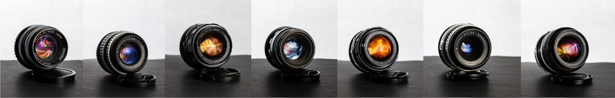
Wide Open
Because fast lenses aren’t just intended to allow for easy focusing in dim light, we start with all lenses shot wide open:

The Voigtländer Color-Ultron clearly takes the lead here. Nice sharpness and contrast with little fringing. The S-M-C Takumar performed quite well too, although the fringing is quite prominent.
The Helios surprised me again, with great punchy contrast and acceptable sharpness. The most interesting thing, however, is the fact that you can clearly make out a difference in the shape of the boke. See how the letters are “distorted”?
The Planar T* and the Zuiko (and to some extent even the Tessar) performed acceptable too.
The Pancolar and the Nikkor 50mm f/1.4 are doing okay, nicely sharp but with very little contrast.
The radioactive Fujinon beats its multi-coated brother in this test, although both are unacceptably soft.
The EBC Fujinon, the Nikkor 50/1.2 Ai-S, the Rikenon and the Yongnuo all are the losers of this comparison.
Note that most lenses don’t suffer from colour-fringing here because they are incapable of producing a sharp image with sufficient contrast anyways.
Now we shall continue by aperture.
Comparison at f/1.4

The Planar and the Zuiko (Olympus) are very close indeed. The latter has only a tad less contrast and the fringing is slightly different (which is most likely due to inaccuracies from the white balance adjustment.
The Takumar outperforms all the rest at f/1.4, with good contrast and sharpness. Unfortunately, it suffers from strong fringing because of the former.
The Nikkor 50mm f/1.4 Ai is quite sharp but weak in contrast.
The Fujinon is both soft and not very contrasty, but better than the EBC version and the very expensive Nikkor 50mm f/1.2 Ai-S. The Nikkor 50/1.2 Ai-S even at f/1.4 is just barely better than the EBC Fujinon at f/1.4.
The Rikenon has more contrast but is by far the softest at f/1.4
Comparison at f/2

By f/2 many of the lenses have greatly improved and deliver acceptable results already. Note that the Color-Ultron is missing. It does not offer a stop at f/2 unfortunately.
The Yongnuo comes in last by far. It’s completely useless if you ask me. The Rikenon is slightly better but still very soft. The two Fujinon lenses are very close together and sharper than the Rikenon, but they can’t even get remotely near the worst of the rest of the field.
Next come the Pancolar and the Helios, of which the former shows more sharpness. Both lenses handle fringing quite well.
All the others are plenty sharp with good contrast and loads of colour fringing too.
The Nikkor 50mm f/1.2 Ai-S is slightly less sharp than the Takumar.
The Olympus beats the Takumar with better sharpness and micro contrast but it also comes with stronger fringing. The Planar T* is on par with the Zuiko.
At f/2 the Nikkor 50mm f/1.4 Ai is the leader. It has best sharpness and contrast.
However, this one was VERY close and the results could easily look different if I had chosen a different area of the frame to focus on.
Comparison at f/2.8

The situation doesn’t get any easier at f/2.8. Many of the lenses now are very sharp with plenty of contrast. Let’s name the losers first then:
The Tessar is unusable compared to the rest at f/2.8. The Yongnuo is still very soft here.
The Rikenon and the Helios both are more than okay with the Helios handling the fringing nicely. However, both can’t really keep up with the rest anymore.
Also, both Fujinons now finally get to deliver acceptable images, ending up on par with the Rikenon at this aperture.
The Nikkor 50mm f/1.2 Ai-S is perfectly sharp but slightly less so than the Takumar or the Olympus which are at the same level.
The Pancolar is about as sharp as the Takumar but it handles the fringing much better than the f/1.4 lenses.
The Voigtländer Color-Ultron and the Zeiss Planar T*, as well as the Nikkor 50mm f/1.4 Ai, all are extremely sharp and contrasty with massive colour fringing.
While not the sharpest of them all, the Pancolar wins this round for me, because it looks the most pleasing to my eyes.
Comparison at f/4

Most lenses by now deliver very nice results and should thus be fine for work in the studio with flash (where I’d shoot at f/5.6 anyways).
However, the Tessar still isn’t very good and the Yongnuo displays significant focus breathing. (It has an auto aperture and focusing happens at f/1.8, that’s why the focal plane is so far off.)
Verdict
Wide open, the Super-Multi-Coated Takumar can hold up to all the praises on the web. It’s the sharpest of my f/1.4 lenses and only the Voigtländer Color-Ultron (at f/1.8 wide open) can beat it in this discipline. A lot of the lenses aren’t very usable shot wide open, which is a pity.
By f/2 the competition gets much harder and many of the f/1.4 lenses, now stopped down by 1 stop, can make up for their failure in the first round.
With the added contrast comes the colour fringing and most of the lenses are extreme in that regard. It’s good to know that you can remove these quite easily in post processing.
At the end of the day, I really like the results from the Pancolar and the Color-Ultron, but also the Takumar is up my alley.

One thought on “50mm Lens Comparison II – Sharpness II”